Take A Stand
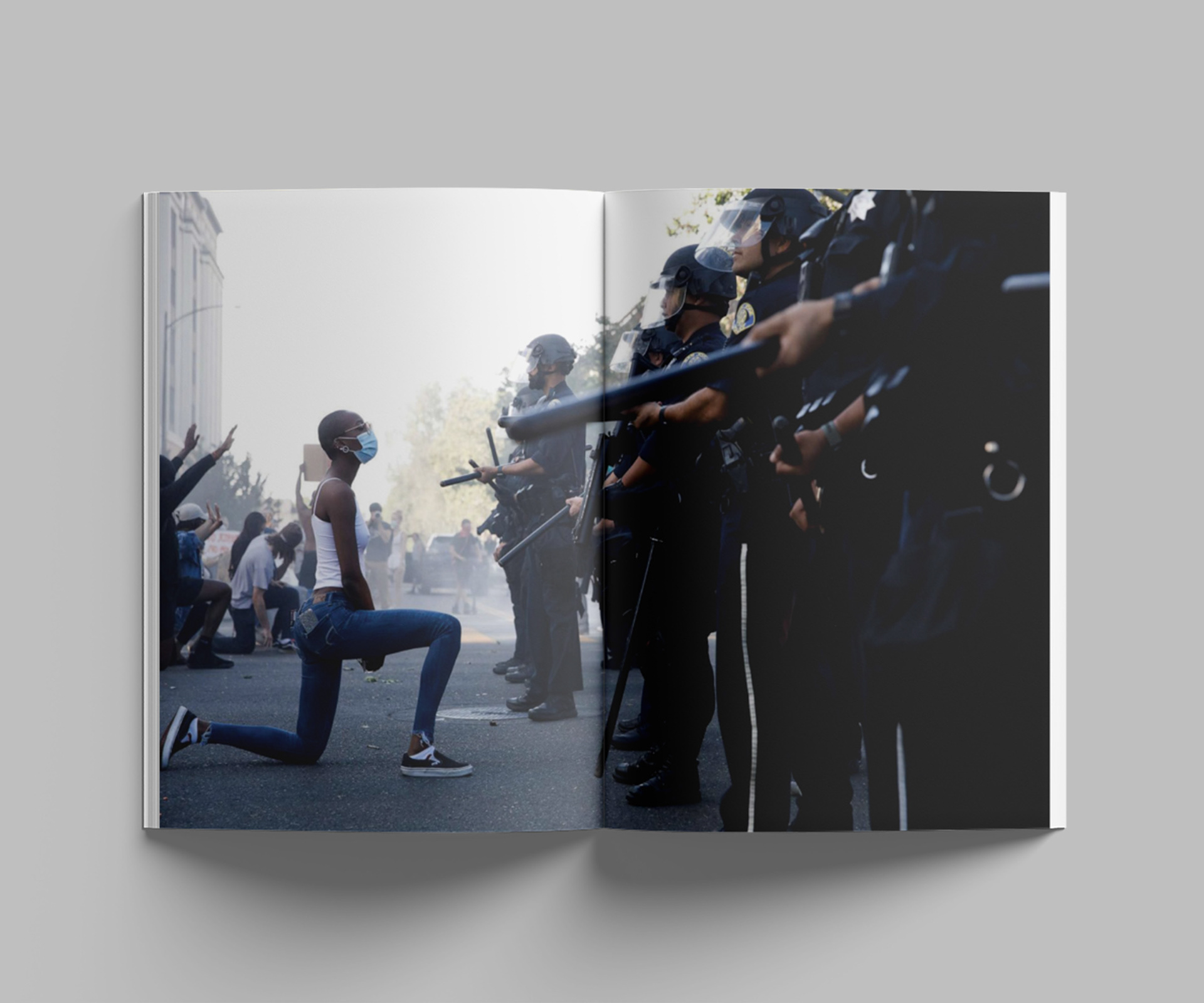
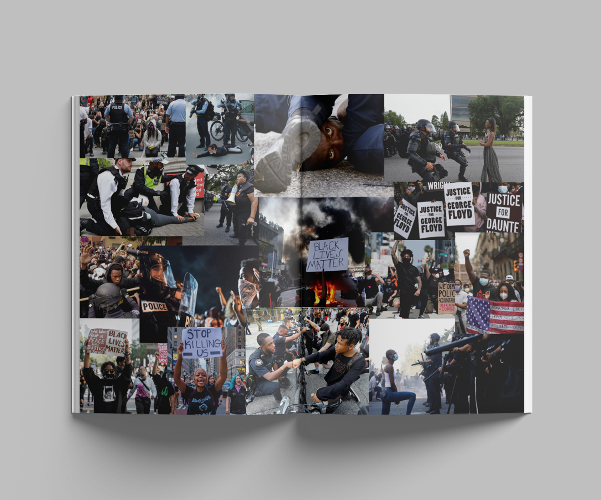
“Take A Stand” is an exhibit catalog that documents the role of graphic design within the Black Lives Matter movement. The catalog takes the reader on a journey through both the early and contemporary expressions of the movement, weaving together a compelling narrative of oppression, resilience, and hope. The design narrative aims to amplify the collective frustration of the people and underscore the power of unity.
Software: Adobe Photoshop, Adobe Indesign and Adobe Illustrator
Illustration
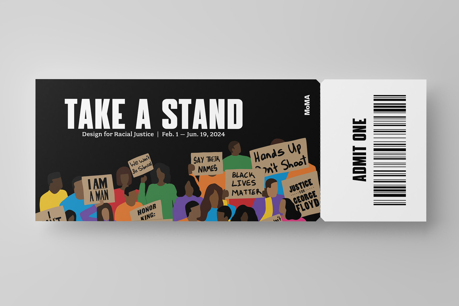
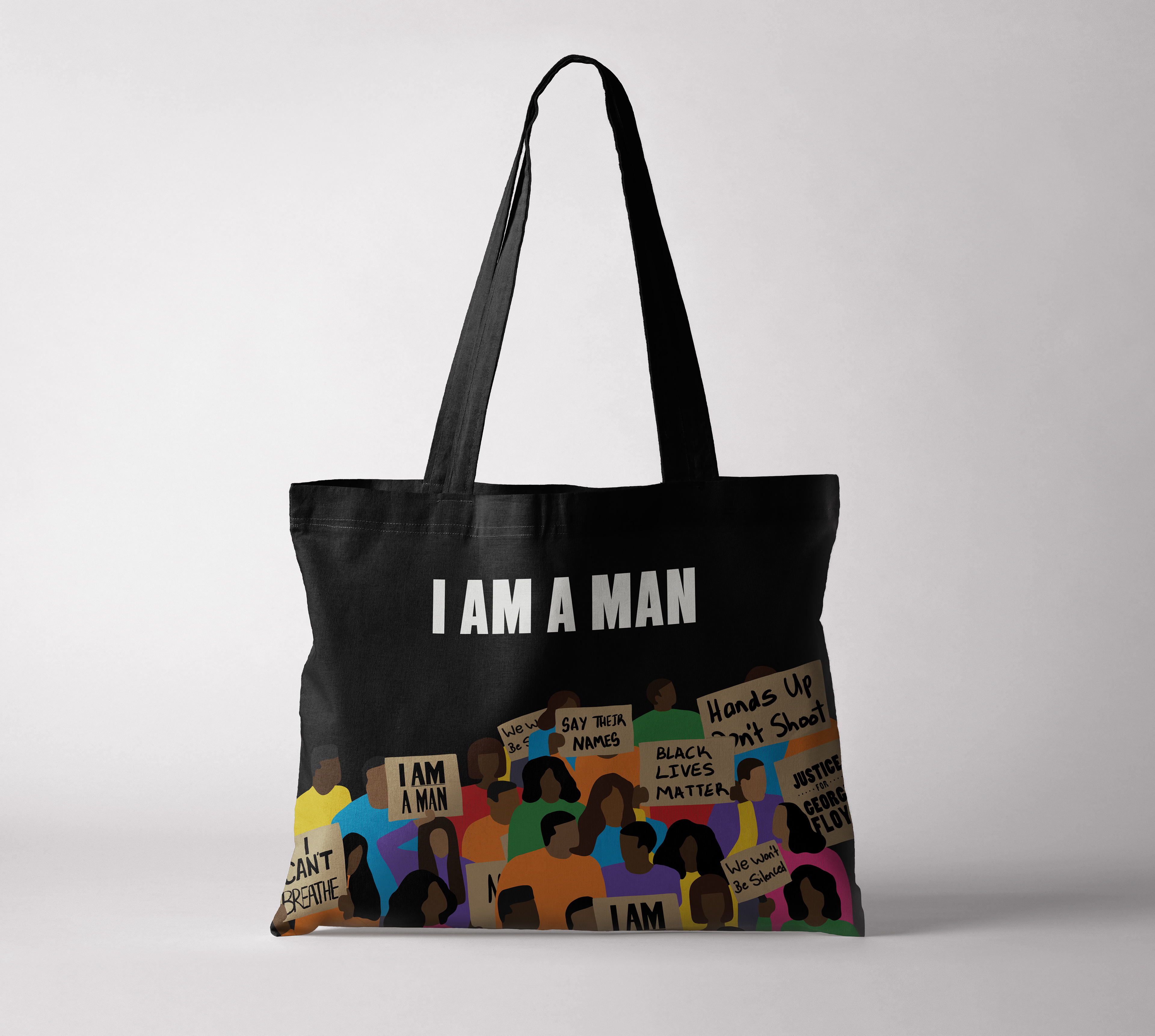
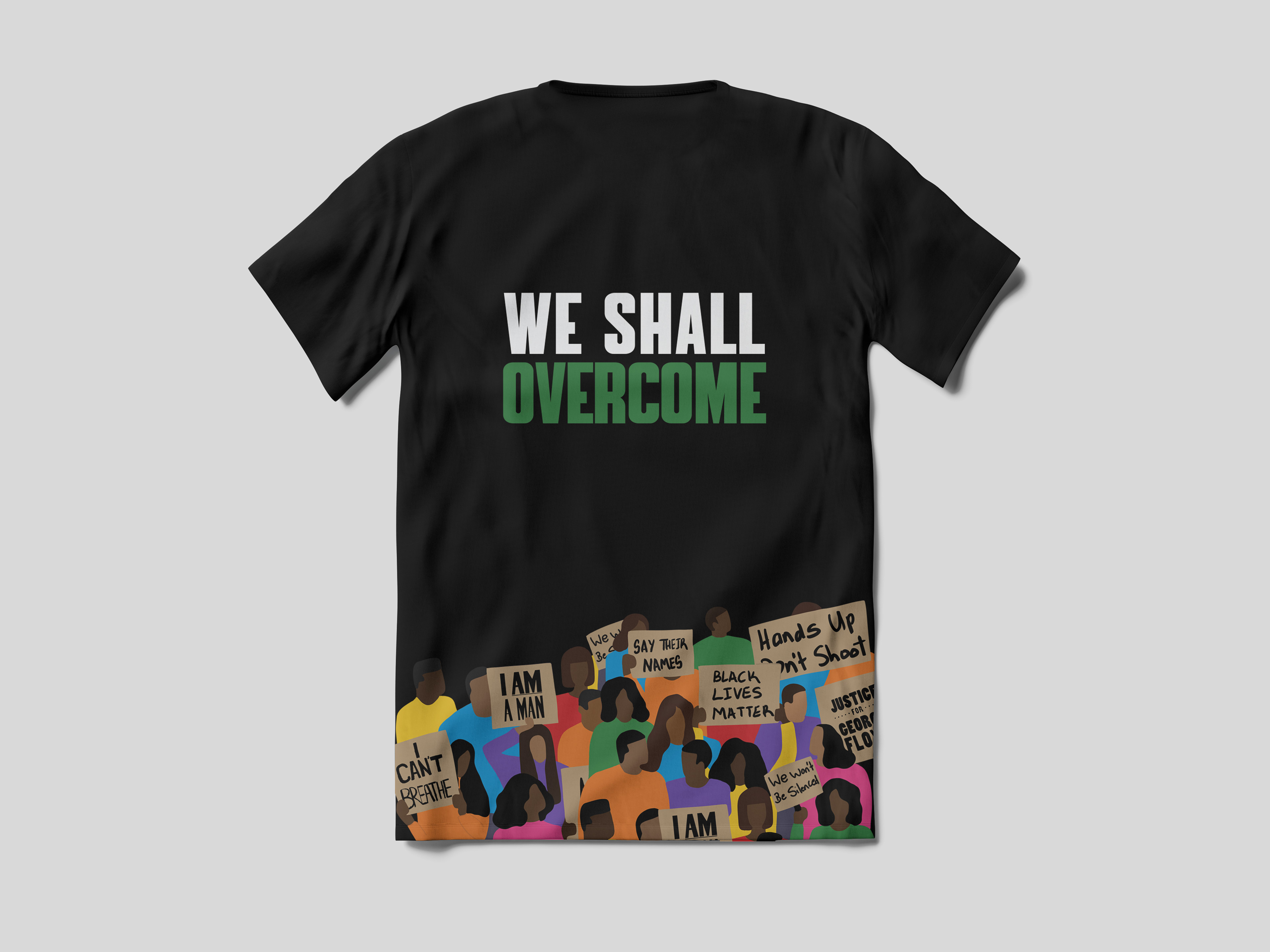
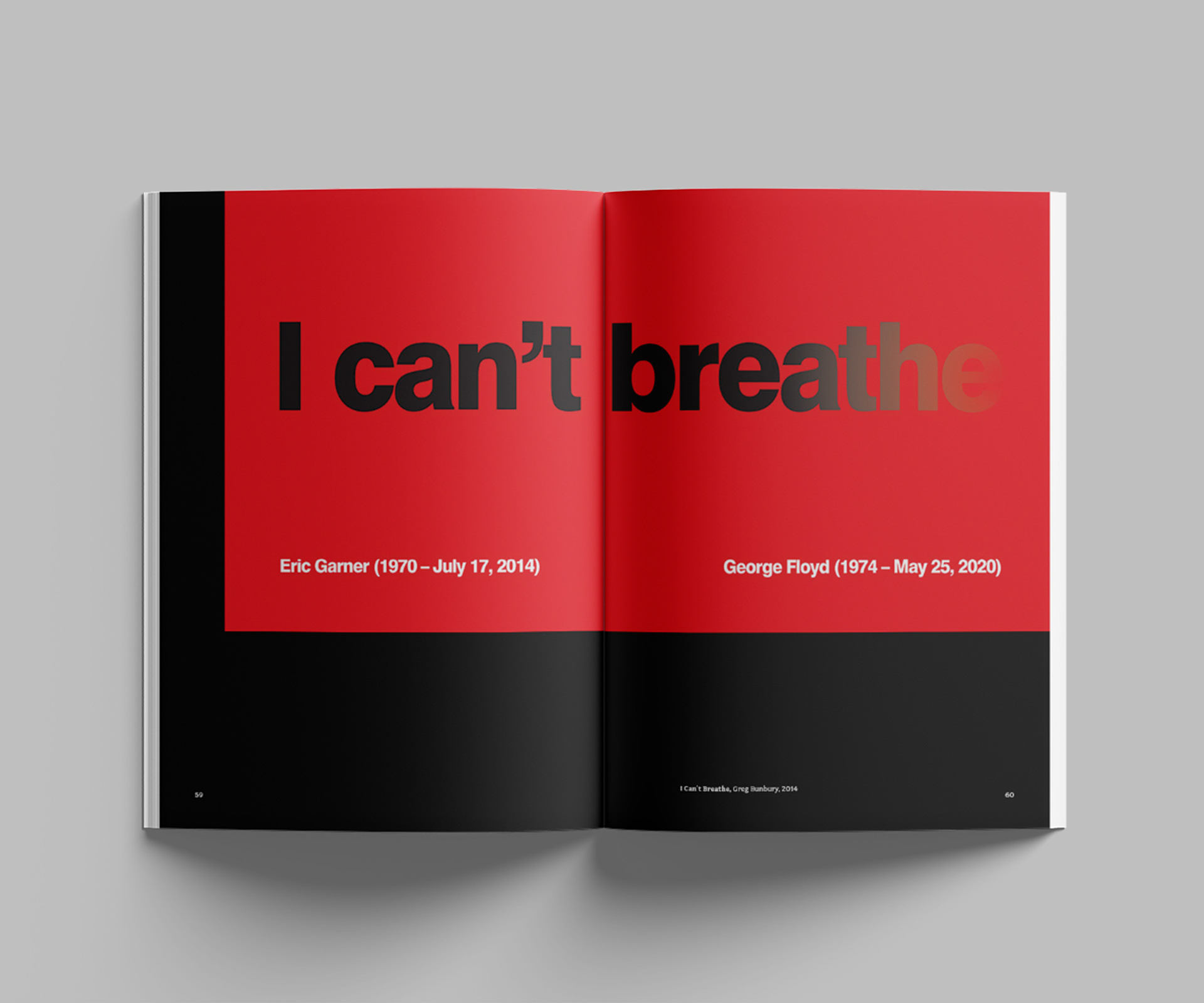
The central graphic of the catalog is an illustration portraying protestors united and wielding signs that express their frustration and bear the names of victims of racism features. By encapsulating the strength found in numbers, the design encourages individuals to ‘take a stand’ and actively contribute to the ongoing struggle for positive change. The colors in the illustration represent different aspects of the movement like police brutality and the famous ‘I Can’t Breathe’ slogan.
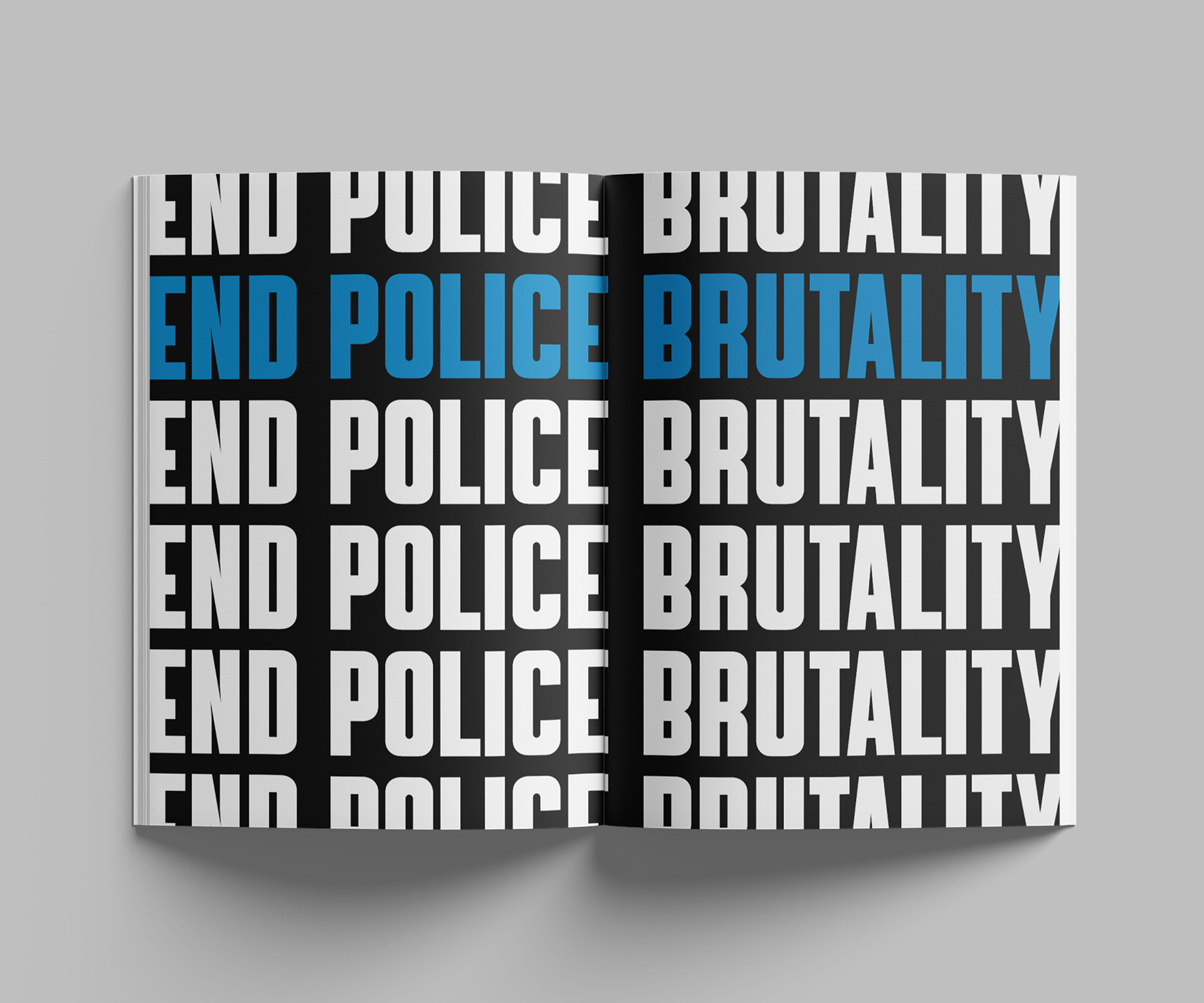
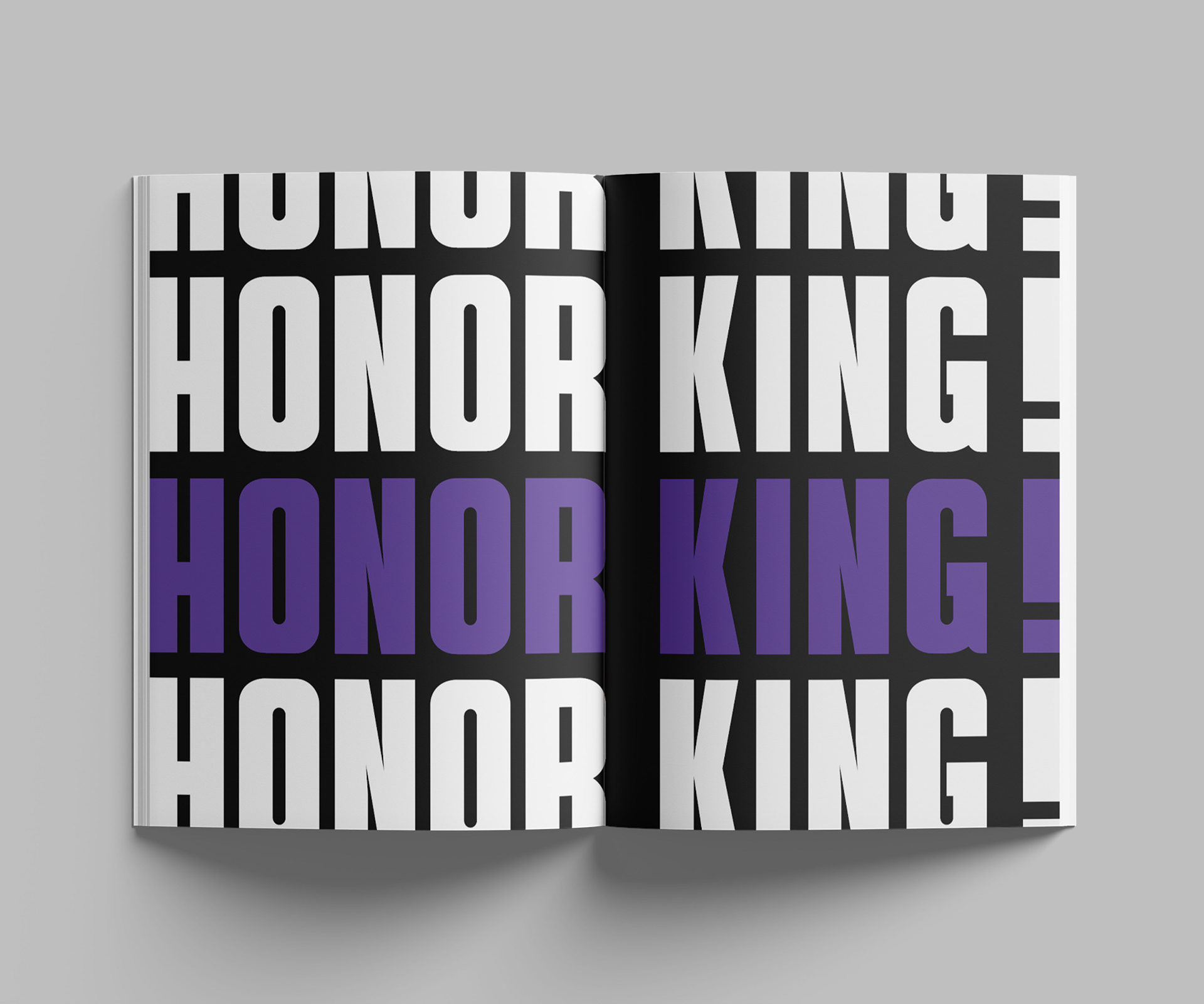
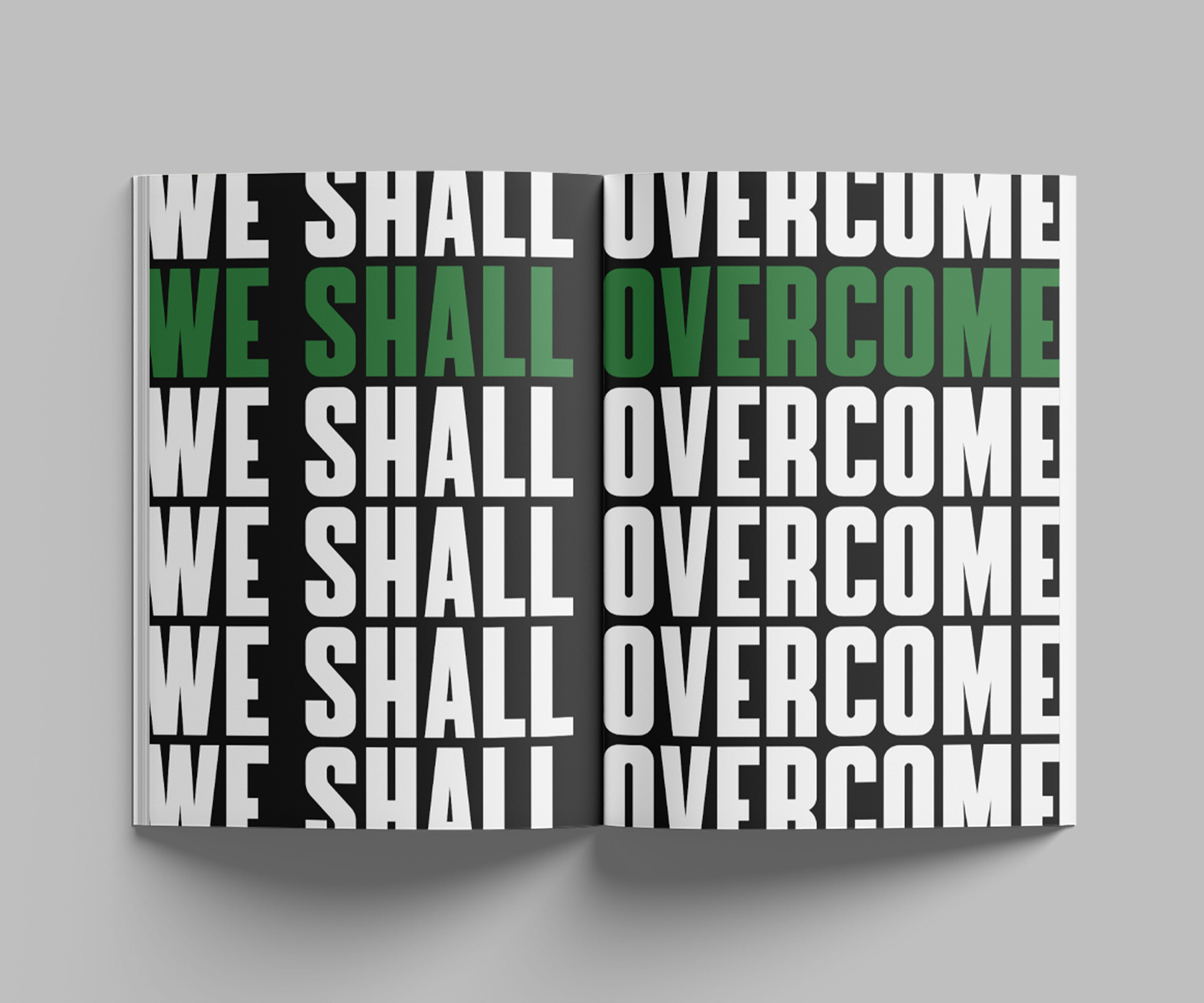
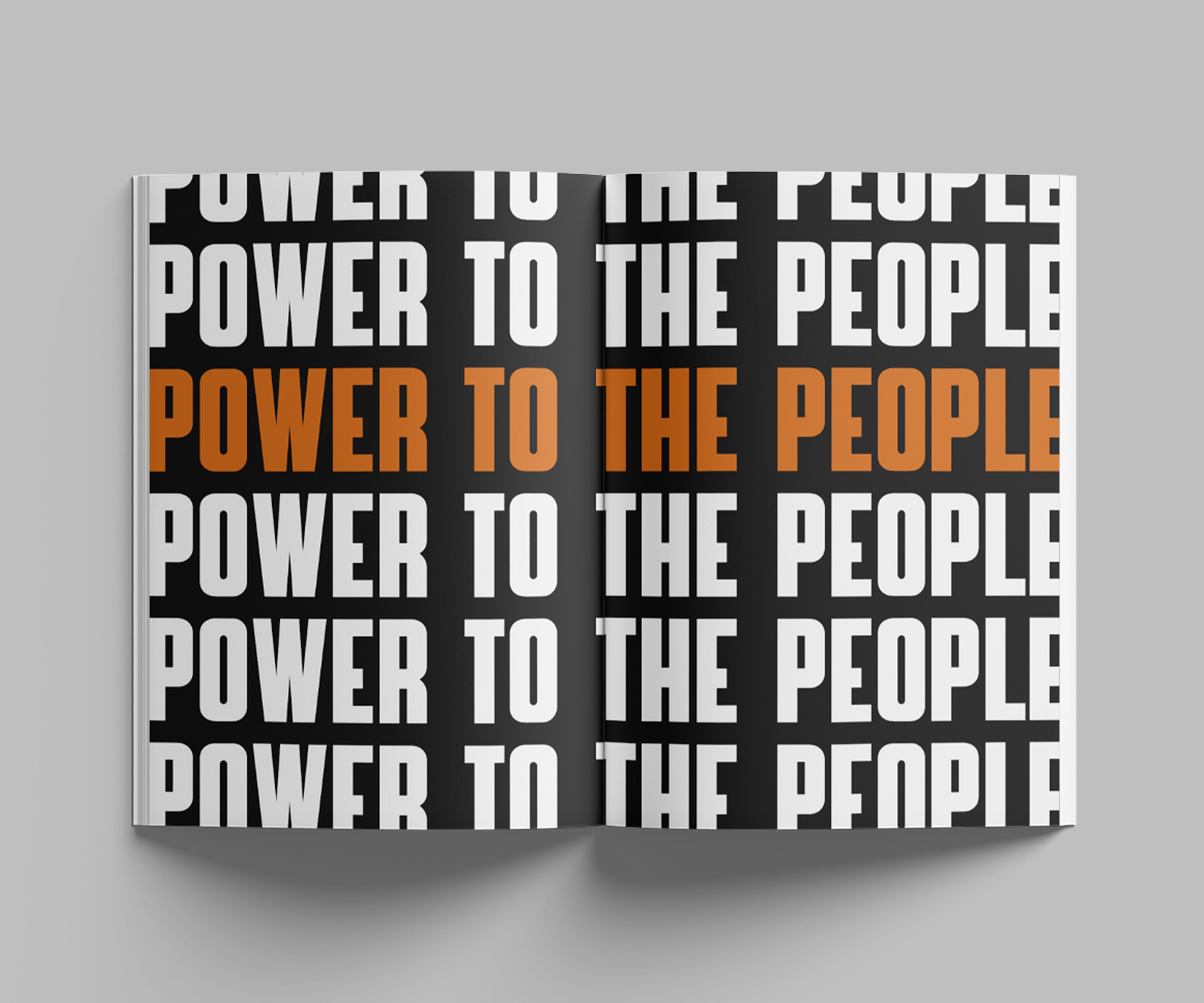
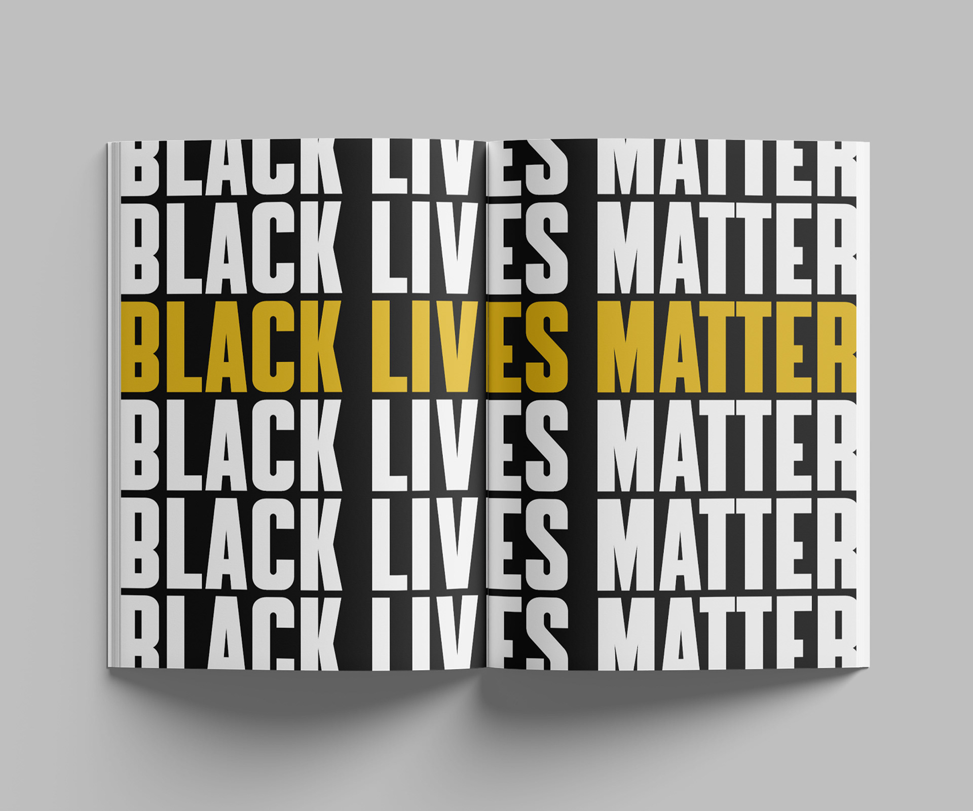
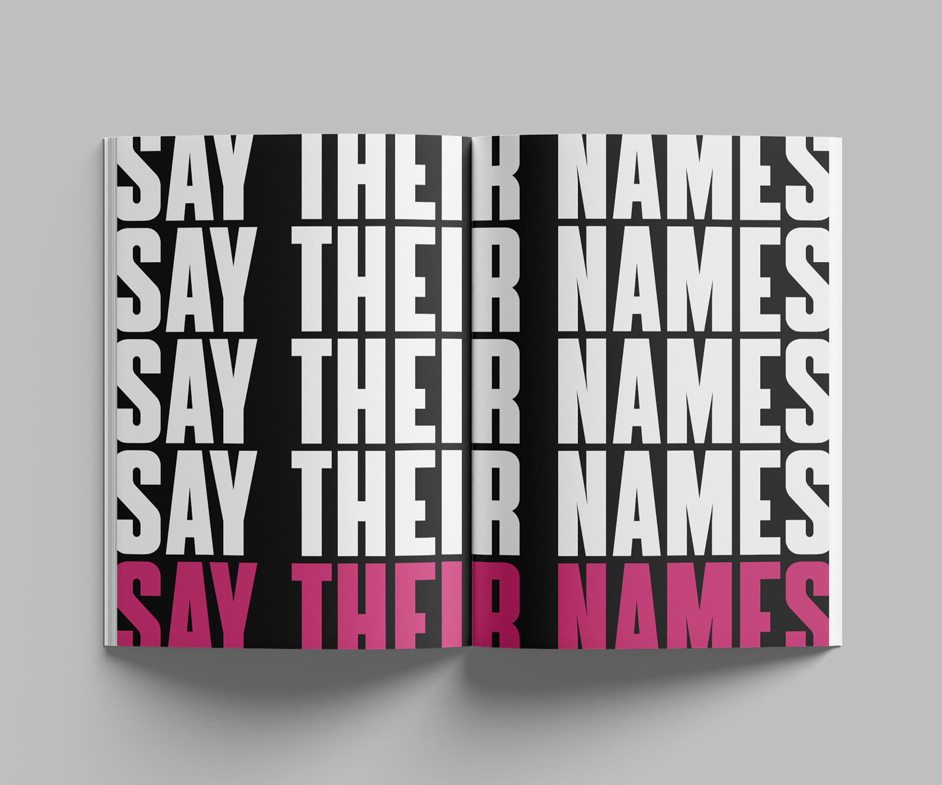
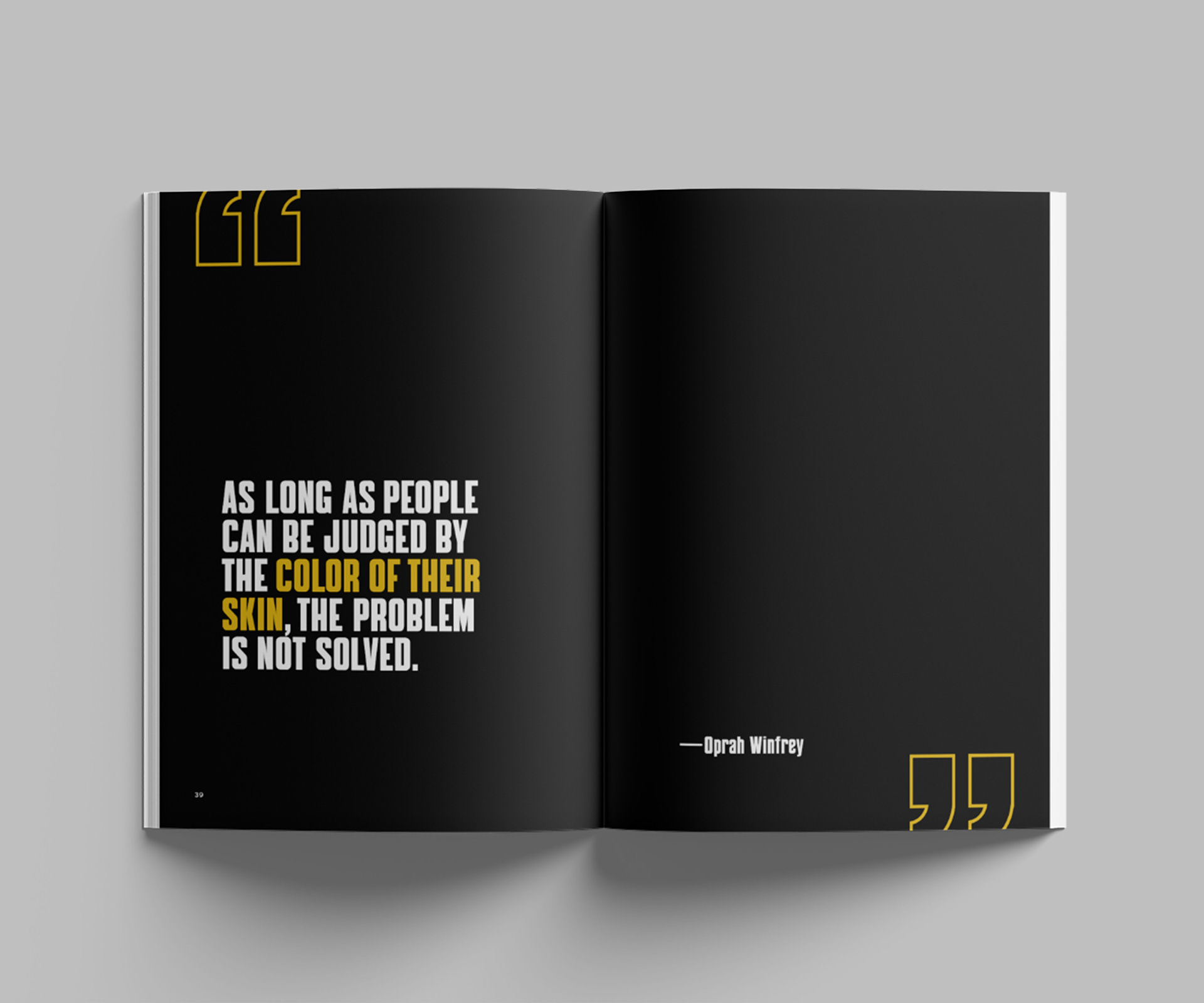
Section Openers
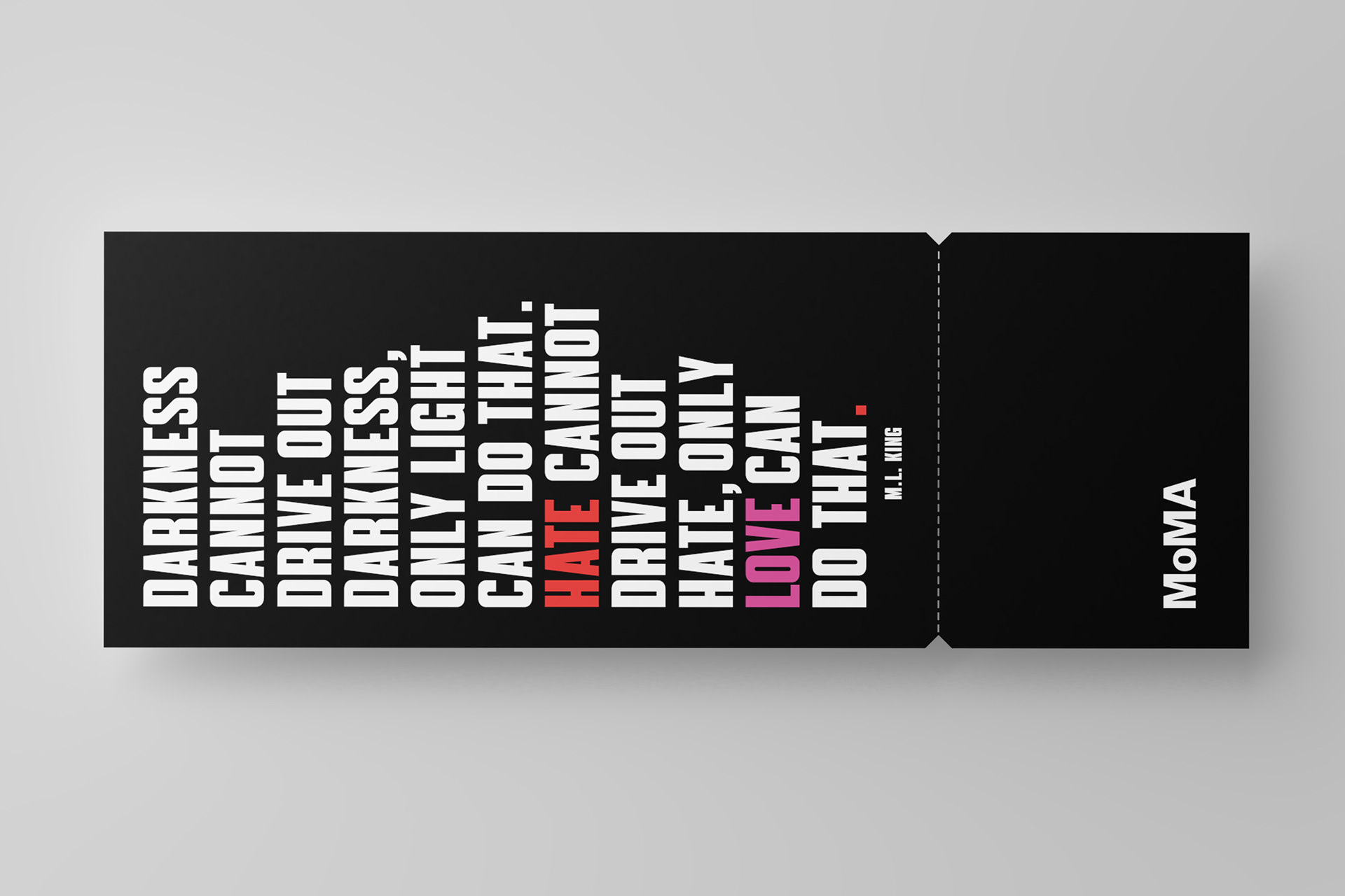
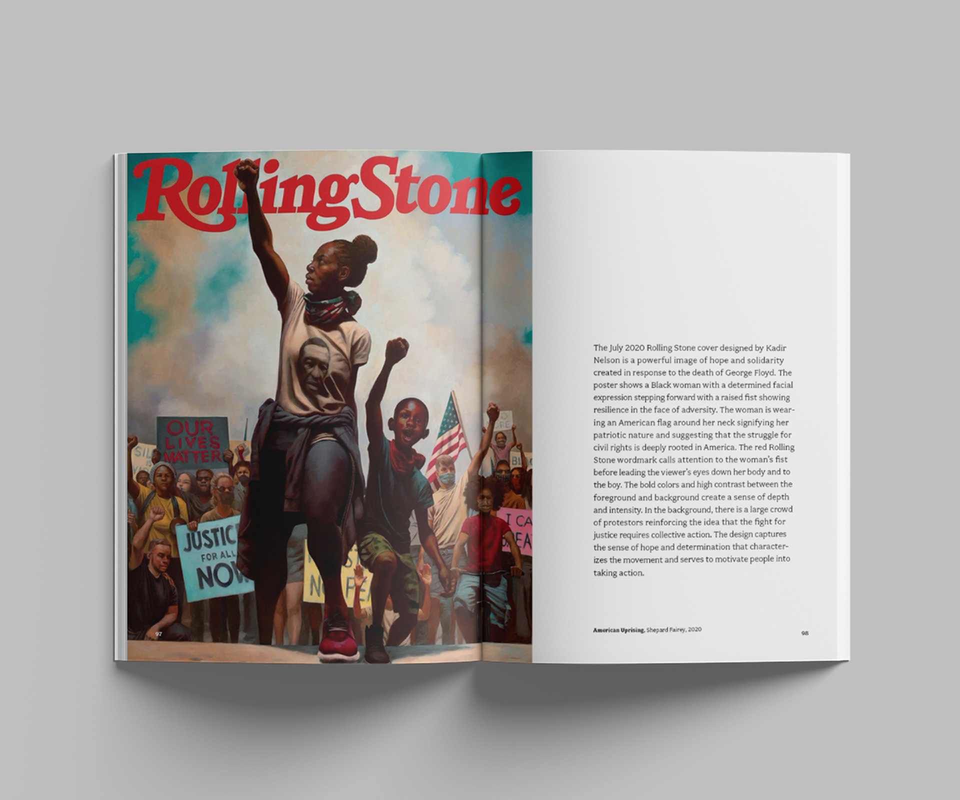
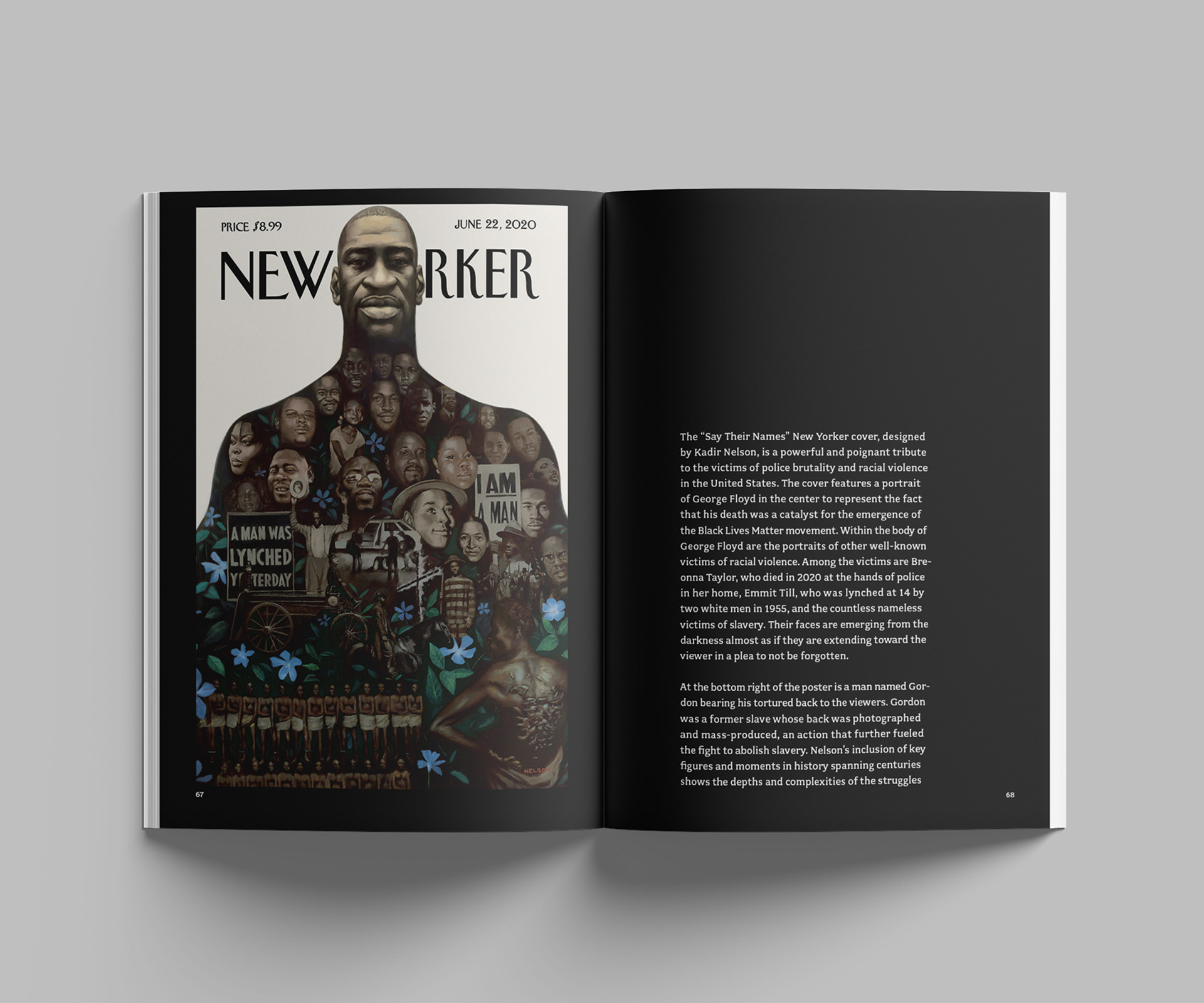
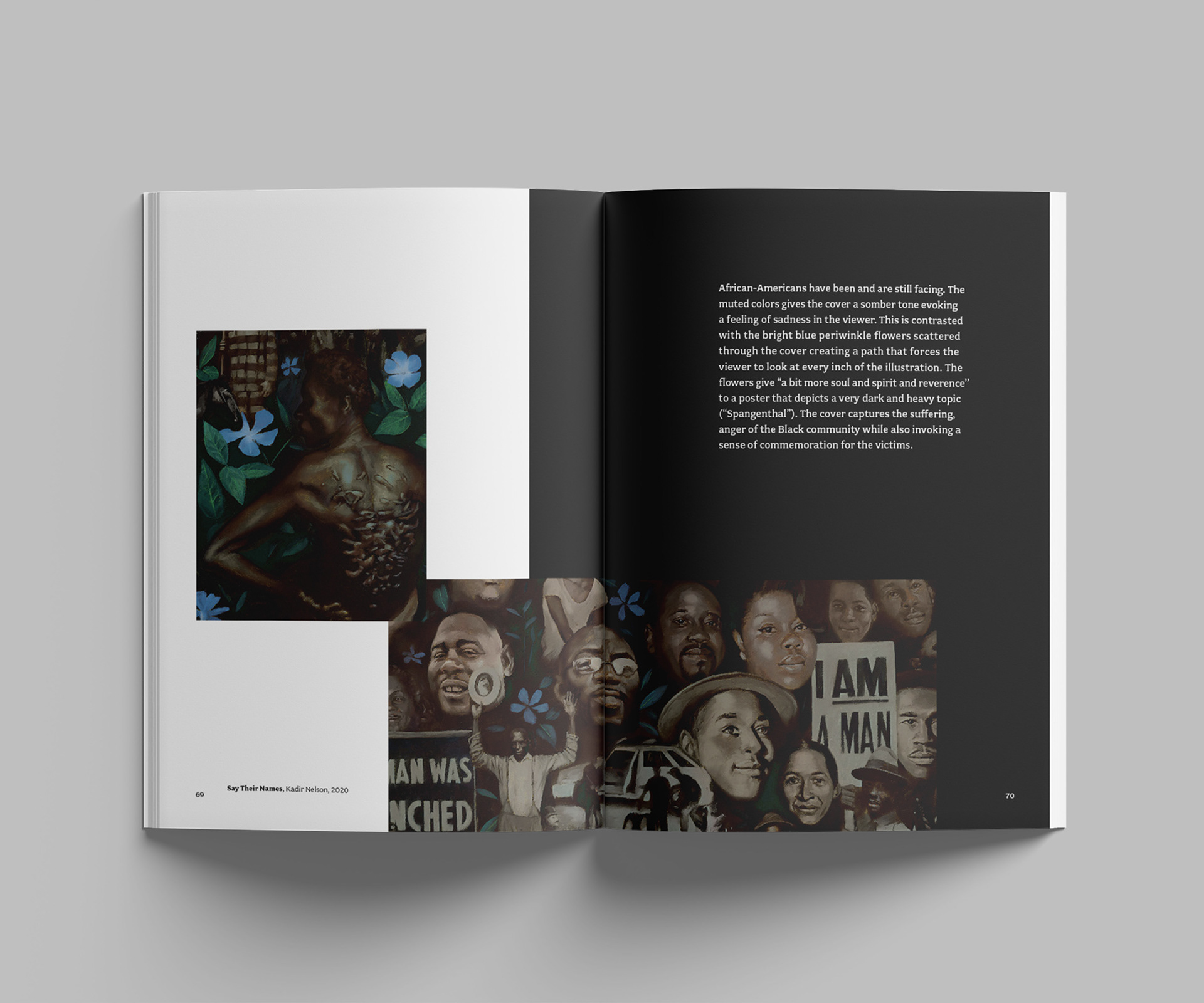
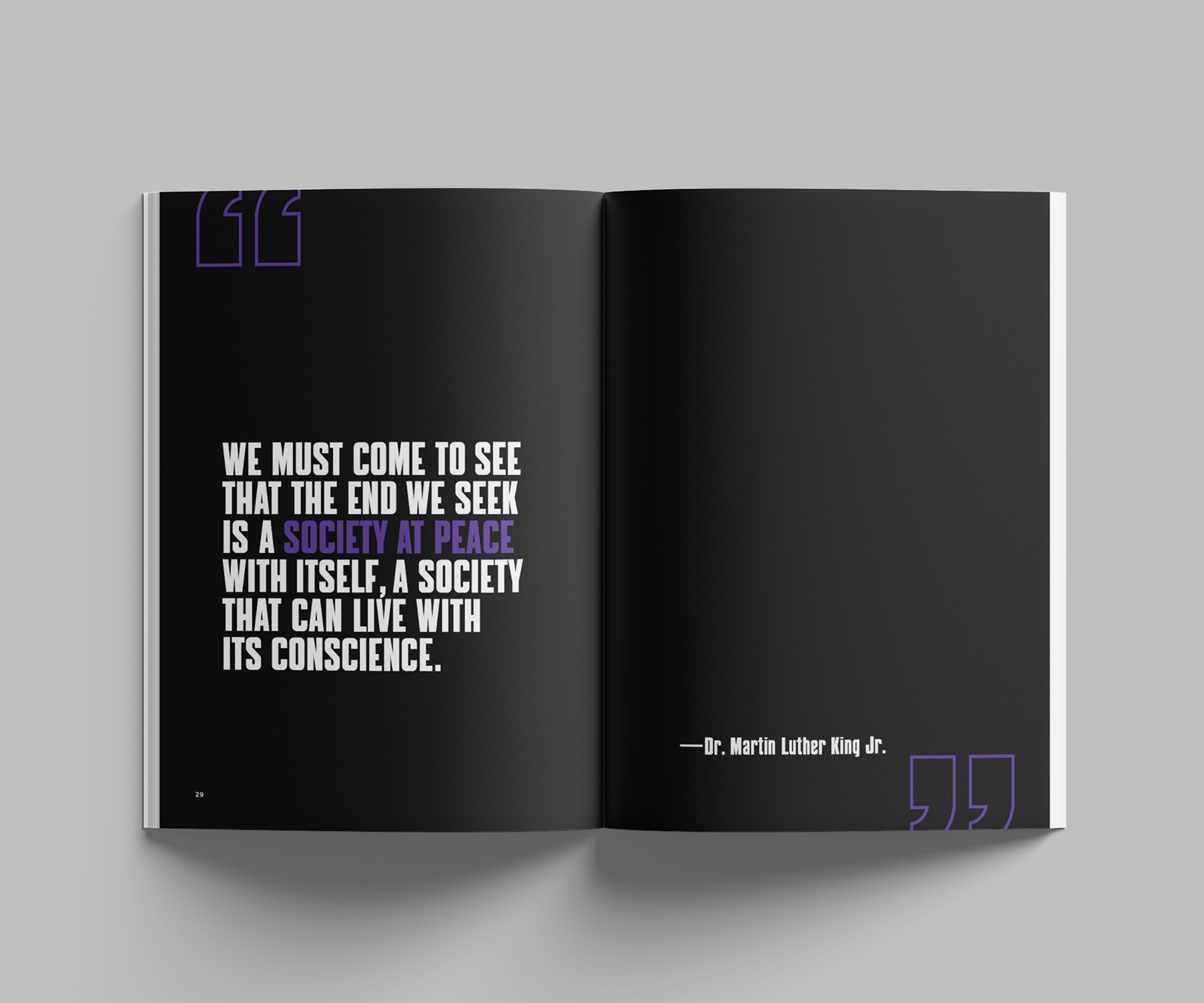
The colors also delineate sections in the catalog related to those aspects. Each section of the catalog is crafted to highlight the numerous instances of graphic design throughout key moments of the movement. The sections are introduced by bold, typographical designs of the section title, followed by quotes from key figures in the movement. Collectively, these elements join to create a well-crafted narrative that portrays graphic design as a potent vehicle for social commentary and activism within the context of the Black Lives Matter movement.
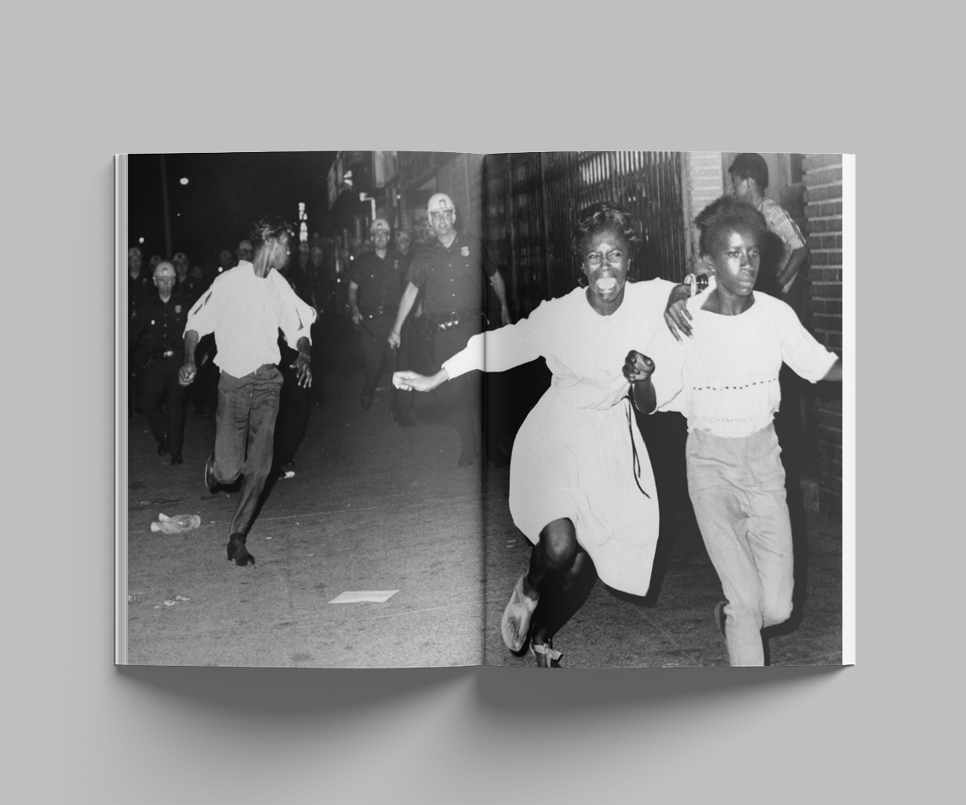
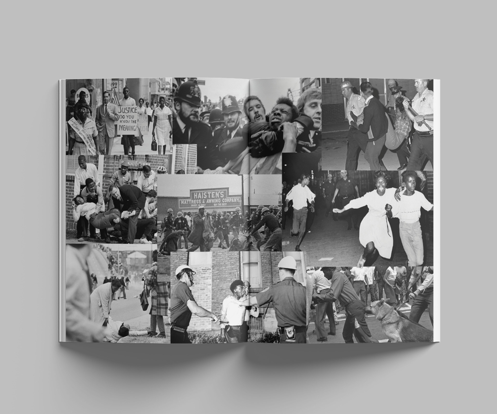
Marketing
The graphic extends to different collaterals that promote the exhibit from banners to the exhibit ticket. The quotes are reused across these different materials to further promote the message of the exhibit.
